Cross-Browser Testing Guide: How to Test Websites Across Browsers
What Is Cross-Browser Testing?
Cross-browser testing is the process of checking whether a website or web application works correctly across different browsers, operating systems, and devices.
The goal is not to make every browser render every pixel identically.
The goal is to make sure users can successfully use the website in the environments the project supports.
Cross-browser QA usually focuses on:
- functionality;
- layout;
- responsive behavior;
- forms;
- navigation;
- JavaScript interactions;
- fonts;
- images;
- media;
- accessibility;
- critical user journeys.
A website may work perfectly in Chrome and still fail in Safari.
That is why browser coverage should be planned rather than assumed.
Why Cross-Browser Testing Matters
Modern browsers follow shared web standards, but they do not always behave identically.
Differences can appear because of:
- rendering engines;
- CSS support;
- JavaScript implementation;
- form controls;
- font rendering;
- media handling;
- browser security rules;
- operating system behavior.
For example:
- a sticky element may behave differently in Safari;
- a date input may look different in Firefox;
- a form may fail only on iPhone Safari;
- a CSS layout may break at one viewport;
- a browser extension or cache may expose unexpected behavior.
Cross-browser testing helps catch these issues before users do.
Browser Testing Is Not Pixel-Perfect Comparison
A common mistake is treating every visual difference as a defect.
Different browsers may naturally render:
- scrollbars;
- form fields;
- select controls;
- fonts;
- focus states;
- date pickers;
slightly differently.
That is not automatically a bug.
Ask instead:
- Does the difference break the layout?
- Does it affect usability?
- Does it block a workflow?
- Does it contradict the design requirement?
Cross-browser QA should focus on meaningful compatibility, not artificial visual sameness.
Start With the Browsers That Matter
Do not test every browser that exists.
Define the supported set.
Common browser families include:
- Google Chrome;
- Safari;
- Microsoft Edge;
- Mozilla Firefox.
Mobile adds:
- Safari on iPhone/iPad;
- Chrome on Android.
The right mix depends on:
- audience;
- analytics;
- client requirements;
- platform;
- risk.
For a structured selection process:
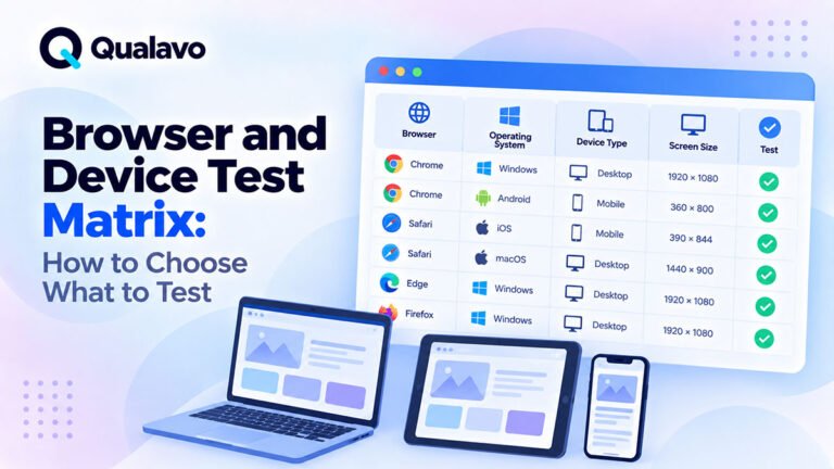
Browser and Device Test Matrix: How to Choose What to Test
Chrome
Chrome is often a primary testing environment.
It is useful for checking:
- core functionality;
- responsive layout;
- JavaScript;
- forms;
- DevTools errors;
- performance sanity.
But passing in Chrome does not prove the website will work everywhere else.
Chrome-based testing should be only one part of coverage.
Safari
Safari deserves special attention.
It uses a different browser engine and may expose issues not seen in Chromium-based browsers.
Common problem areas include:
- sticky/fixed positioning;
- viewport behavior;
- mobile forms;
- autofill;
- date inputs;
- CSS features;
- video;
- Apple Pay;
- keyboard behavior.
If iPhone users are important to the website, Safari should usually be a priority environment.
Microsoft Edge
Modern Edge is Chromium-based, so it often behaves similarly to Chrome.
Still test it when it is part of the supported environment.
Differences may appear due to:
- Windows integration;
- enterprise settings;
- browser policies;
- rendering details;
- extensions;
- security configuration.
For B2B and corporate websites, Edge can be especially important.
Firefox
Firefox uses a different rendering engine.
It can reveal issues related to:
- CSS;
- flex/grid behavior;
- form controls;
- JavaScript assumptions;
- focus handling;
- scrolling.
Even if Firefox traffic is smaller than Chrome, it can provide valuable compatibility coverage.
Mobile Browsers Need Separate Testing
Mobile browser testing is not simply desktop testing at a narrow viewport.
Real mobile devices introduce:
- touch interaction;
- virtual keyboards;
- safe areas;
- mobile browser bars;
- orientation;
- viewport changes;
- device-specific behavior.
A website can pass desktop browser testing and still fail on mobile Safari or Android Chrome.
1. Test the Main User Journey First
Begin with the most important workflow.
Examples:
Marketing Website
Homepage → Service Page → Contact Form → Confirmation
E-commerce
Product → Cart → Checkout → Payment → Confirmation
SaaS
Signup → Login → Core Action → Save
Run the same critical path in each primary browser.
If the business-critical journey fails in one supported browser, that matters more than a small spacing difference on a secondary page.
2. Check Navigation
Test:
- header menu;
- dropdowns;
- mega menus;
- mobile menu;
- footer links;
- CTA buttons.
Look for:
- hover behavior;
- keyboard interaction;
- menu positioning;
- clipping;
- focus issues.
Navigation defects can make the entire site difficult to use.
3. Test Links
Check important:
- internal links;
- external links;
- anchor links;
- downloads;
- button links.
Verify:
- destination;
- target behavior;
- no browser-specific failures;
- no blocked popups where a popup is intentionally used.
4. Test Forms
Forms are a high-priority cross-browser area.
Check:
- input fields;
- dropdowns;
- checkboxes;
- radio buttons;
- validation;
- submit;
- error messages;
- success state.
Different browsers may render native controls differently.
Focus on usability and function.
5. Test Form Validation
Try:
- valid submission;
- empty required fields;
- invalid email;
- incorrect format;
- long input;
- special characters.
Verify:
- messages appear;
- fields are identified;
- browser-native validation does not conflict with custom validation.
6. Test Date and Time Inputs
Native date/time controls vary widely across browsers.
Check:
- opening picker;
- manual input;
- format;
- mobile behavior;
- validation;
- timezone logic where relevant.
Do not assume Chrome behavior matches Safari or Firefox.
7. Test File Uploads
If the site has file uploads, verify:
- file picker opens;
- allowed file types work;
- invalid files are rejected;
- upload progress works;
- error state is clear.
Mobile upload behavior can differ from desktop.
8. Test Modal Windows
Check:
- open;
- close;
- overlay;
- scroll locking;
- keyboard;
- focus;
- mobile layout.
Modals often reveal browser-specific layout and interaction bugs.
9. Test Dropdowns and Select Controls
Native dropdowns may look different.
That is acceptable if they remain usable.
Check:
- correct options;
- selection;
- keyboard behavior;
- mobile interaction.
Custom dropdowns need deeper testing because they rely more heavily on JavaScript and CSS.
10. Test Tabs and Accordions
Check:
- click/tap;
- keyboard;
- active state;
- content visibility;
- responsive behavior.
Watch for content disappearing in one browser.
11. Test Sticky and Fixed Elements
Sticky UI can behave differently across browsers.
Examples:
- sticky header;
- sticky CTA;
- fixed footer;
- floating chat;
- floating filters.
Check:
- positioning;
- scrolling;
- overlap;
- mobile browser UI interaction.
Safari often deserves special attention here.
12. Test CSS Layout
Review:
- flexbox;
- CSS Grid;
- multi-column layouts;
- cards;
- image/text alignment.
Look for:
- overflow;
- collapsed columns;
- unexpected wrapping;
- inconsistent height;
- broken alignment.
Modern CSS support is generally strong, but browser-specific issues still occur.
13. Test Responsive Breakpoints
Browser compatibility and responsive testing overlap.
Check representative widths.
Examples:
- 320px;
- 375px;
- 390px;
- 768px;
- 1024px;
- 1440px.
Also test around layout breakpoints.
For example:
- 767px;
- 768px;
- 769px.
This often reveals breakpoint bugs.
14. Test Orientation
On mobile or tablet, check:
- portrait;
- landscape.
This is particularly useful for:
- forms;
- video;
- modals;
- dashboards;
- tables.
15. Check Horizontal Scrolling
Unexpected horizontal scrolling often signals a responsive bug.
Check whether:
- content extends outside viewport;
- large images overflow;
- long text breaks layout;
- tables cause problems.
Mobile Safari may expose overflow differently from desktop browsers.
16. Check Fonts
Different operating systems and browsers may render fonts differently.
Verify:
- intended font loads;
- fallback is acceptable;
- no missing characters;
- no extreme layout shift.
A small rendering difference is normal.
A broken layout caused by font loading is not.
17. Check Icons
Verify:
- icon fonts;
- SVG icons;
- inline icons;
- social icons.
Look for:
- missing icon;
- blank square;
- incorrect alignment;
- wrong size.
18. Check Images
Test:
- loading;
- responsive sizing;
- aspect ratio;
- lazy loading;
- WebP/AVIF behavior where used.
Check whether images disappear or fail only in one browser.
19. Test Background Images
Background images can behave differently with:
- cover;
- contain;
- fixed background;
- responsive sections.
Check important hero sections separately.
20. Test Video and Audio
If media is used, verify:
- playback;
- controls;
- autoplay rules;
- mute;
- fullscreen;
- mobile behavior.
Browsers apply different restrictions to autoplay.
21. Test Hover Interactions
Hover does not exist in the same way on touch devices.
If an important action appears only on hover, test whether mobile users can still access it.
Examples:
- tooltip;
- dropdown;
- card actions;
- image overlays.
22. Test Keyboard Interaction
Cross-browser QA should also include keyboard basics.
Check:
- Tab;
- Shift + Tab;
- Enter;
- Space;
- Escape.
Verify:
- focus visible;
- focus order logical;
- controls work.
For broader accessibility coverage:
Website Accessibility Testing Checklist: A Practical QA Guide
23. Test Focus States
CSS focus styling can behave differently across browsers.
Check:
- links;
- buttons;
- form fields;
- custom controls.
The browser should not remove or hide focus unexpectedly.
24. Test Scrolling
Check:
- normal scrolling;
- nested scrolling;
- sticky elements;
- modals;
- horizontal sections.
Watch for:
- jumpy scroll;
- frozen page;
- scroll locked after modal close.
25. Test Anchors and Scroll-To Behavior
If the page uses anchor links:
- click link;
- verify correct section;
- check sticky header does not hide target;
- test smooth scrolling where implemented.
26. Test Browser Back and Forward
Check dynamic interactions.
Examples:
- search;
- filters;
- checkout steps;
- modals;
- SPA navigation.
Browser history behavior may reveal state bugs.
27. Test Refresh
Refresh important states.
Examples:
- filtered results;
- cart;
- logged-in page;
- modal state;
- partially completed form.
Verify expected persistence.
28. Test JavaScript-Heavy Features
Pay extra attention to:
- sliders;
- carousels;
- drag-and-drop;
- infinite scroll;
- dynamic forms;
- dashboards;
- interactive charts.
These can behave differently if browser APIs differ.
29. Check Console Errors
Open developer tools.
Look for:
- JavaScript exceptions;
- failed resources;
- CORS errors;
- blocked scripts.
A page can look correct while the console reveals a broken feature.
Do not treat every warning as a blocker.
Focus on errors connected to real user impact.
30. Check Network Failures
Inspect important actions.
Look for:
- HTTP 4xx;
- HTTP 5xx;
- failed API requests;
- blocked assets.
This is particularly useful for forms and authentication.
31. Check Browser Autofill
Autofill can behave differently.
Test:
- email;
- name;
- address;
- login;
- checkout.
Look for:
- wrong field mapping;
- broken layout;
- overlapping labels.
32. Test Password Managers
For login forms, verify:
- username recognized;
- password recognized;
- autofill works;
- show/hide control does not break input.
For deeper authentication QA:
How to Test Login, Signup and Password Reset Flows
33. Test Cookie and Session Behavior
Verify:
- login session;
- logout;
- remember me;
- session expiration.
Browser privacy settings may expose differences.
Safari in particular may behave differently around cross-site data.
34. Test Third-Party Embeds
Examples:
- maps;
- chat widgets;
- video embeds;
- booking widgets;
- social content.
Check:
- loading;
- layout;
- cookie restrictions;
- mobile.
Third-party content may behave differently across browsers because of privacy policies.
35. Test Payment Methods
For e-commerce, payment methods may be browser-dependent.
Examples:
- Apple Pay;
- Google Pay;
- PayPal;
- card iframe.
Test payment methods in the environments where they are intended to appear.
For full checkout coverage:
How to Test an E-commerce Checkout Flow
36. Test Authentication Providers
If the site supports:
- Google login;
- Microsoft login;
- Apple login;
verify each supported browser.
OAuth flows may depend on:
- popup behavior;
- redirects;
- cookies;
- CSP;
- browser privacy rules.
37. Test Popups
Browsers may block certain popup behavior.
If the application intentionally opens a new window, verify:
- popup opens;
- callback works;
- user can return;
- blocked-popup fallback is clear.
38. Test Download Behavior
Check:
- PDFs;
- ZIP files;
- exports;
- documents.
Different browsers may:
- open;
- download;
- preview;
files differently.
That is acceptable if the user can complete the intended action.
39. Test Printing Where Required
If the project supports printing, verify:
- page prints;
- important content visible;
- navigation not required;
- layout reasonable.
Browser print engines can differ significantly.
40. Test Large Screens
Large desktop screens can expose:
- excessive whitespace;
- stretched sections;
- too-wide text;
- misaligned cards.
Check max-width behavior.
41. Test Small Screens
Small screens often reveal:
- overflow;
- clipped buttons;
- navigation issues;
- overly large headings.
A 320px viewport can still be useful for stress testing.
42. Test Real Devices for High-Risk Mobile Workflows
Emulation is useful, but real devices add confidence.
Prioritize real-device testing for:
- checkout;
- login;
- booking;
- complex forms;
- mobile navigation.
43. Use Emulation for Broad Responsive Coverage
Browser DevTools are efficient for testing:
- breakpoints;
- layout;
- quick mobile sanity;
- viewport changes.
Use emulation for breadth.
Use real devices for depth.
44. Do Not Trust Browser Emulation as Exact Device Behavior
Device emulation may approximate:
- viewport;
- pixel ratio;
- touch.
It may not reproduce:
- real browser chrome;
- keyboard;
- hardware;
- performance;
- actual Safari behavior.
Use it as a tool, not a perfect substitute.
45. Build a Browser Test Matrix
Document what will be tested.
Example:
| Priority | Browser | Platform | Coverage |
|---|---|---|---|
| Tier 1 | Chrome | Windows | Full critical flow |
| Tier 1 | Safari | iPhone | Full critical flow |
| Tier 1 | Chrome | Android | Full critical flow |
| Tier 2 | Edge | Windows | Core workflows |
| Tier 2 | Safari | macOS | Core workflows |
| Tier 2 | Firefox | Windows | Core workflows |
For matrix design:
Browser and Device Test Matrix: How to Choose What to Test
46. Use Coverage Tiers
Not every browser needs identical depth.
Tier 1
Test:
- critical journeys;
- forms;
- account;
- checkout;
- responsive;
- regression.
Tier 2
Test:
- core functionality;
- primary pages;
- major interactions.
Tier 3
Test:
- smoke coverage;
- major layout issues.
This helps control QA effort.
47. Use Analytics to Prioritize
If you have real traffic data, use it.
Review:
- browsers;
- devices;
- operating systems;
- screen sizes.
Example:
If 45% of traffic is iPhone Safari, it deserves strong coverage.
Do not blindly use global browser statistics if your own audience is different.
48. Use Historical Bugs to Prioritize
Past defects are useful evidence.
If Safari repeatedly causes problems, give it more attention even if its traffic is lower.
Risk is not only usage.
It is also defect history.
49. Increase Coverage After Browser-Sensitive Changes
Browser testing should adapt to release changes.
Increase coverage after changes to:
- CSS;
- navigation;
- forms;
- authentication;
- payments;
- modals;
- responsive layout.
Do not rerun the exact same depth for every release if risk differs.
50. Retest Browser-Specific Bugs in the Same Environment
If a bug was found in:
Safari / iPhone
retest it in:
Safari / iPhone
Do not close it because it works in Chrome.
Then perform relevant regression in other important browsers where needed.
51. Record Environment in Every Browser Bug
A cross-browser defect should include:
- browser;
- version where relevant;
- OS;
- device;
- viewport;
- URL.
Example:
Safari 18 / macOS / 1440px
This makes reproduction easier.
For a full bug structure:
Bug Report Template: What Every Defect Report Should Include
52. Distinguish Browser Bug From Responsive Bug
A useful QA question is:
Does this fail because of the browser, or because of the viewport?
Test combinations.
For example:
- Chrome at 375px;
- Safari at 375px.
If only Safari fails, it may be browser-specific.
If both fail, it may be responsive layout.
This helps development investigate faster.
53. Distinguish OS Difference From Browser Difference
Similarly, compare:
- Chrome / Windows;
- Chrome / macOS.
If the issue appears only on one OS, it may relate to:
- system fonts;
- native controls;
- OS behavior.
Document the environment precisely.
54. Test Critical Browsers After Deployment
Production configuration can create new issues.
After deployment, run a focused smoke test in the most important environments.
Example:
- Chrome desktop;
- Safari iPhone;
- Chrome Android.
You do not need to rerun the entire matrix.
For post-release testing:
Post-Deployment Smoke Testing: What to Check After Release
A Practical Cross-Browser Testing Checklist
Navigation
- Header navigation works.
- Dropdowns work.
- Mobile menu works.
- Footer links work.
- CTA links work.
Forms
- Inputs work.
- Dropdowns work.
- Required validation works.
- Errors display correctly.
- Form submission succeeds.
- Autofill does not break layout.
Layout
- Main grids render correctly.
- No unexpected overflow.
- Fonts load correctly.
- Images load correctly.
- Icons display.
- Sticky elements work.
Responsive
- Small mobile checked.
- Standard mobile checked.
- Tablet checked where relevant.
- Desktop checked.
- Breakpoint boundaries tested.
- Orientation checked where relevant.
Interaction
- Modals work.
- Tabs work.
- Accordions work.
- Dropdowns work.
- Sliders/carousels work.
- Browser Back/Forward works where relevant.
Accessibility
- Keyboard navigation works.
- Focus is visible.
- Controls are operable.
- Mobile touch targets are usable.
Technical
- No critical console errors.
- No critical network failures.
- Important third-party integrations work.
- Sessions behave correctly.
- Downloads/uploads work where relevant.
Release
- Tier 1 browsers completed.
- Critical workflows pass.
- Browser-specific defects retested.
- Remaining compatibility issues documented.
- Production browser smoke test planned.
Cross-Browser Testing for Marketing Websites
Prioritize:
- homepage;
- navigation;
- forms;
- CTA;
- responsive design.
A simple site may need less browser depth than a web application.
Cross-Browser Testing for E-commerce
Prioritize:
- product;
- cart;
- checkout;
- payment;
- confirmation.
Browser-specific payment behavior makes e-commerce higher risk.
For full e-commerce QA:
E-commerce Website Testing Checklist: What to Test Before Launch
Cross-Browser Testing for SaaS
Prioritize:
- authentication;
- dashboard;
- forms;
- tables;
- CRUD operations;
- modals;
- integrations.
Complex JavaScript interfaces can reveal more browser-specific defects.
For broader SaaS QA:
SaaS QA Checklist: What to Test in a Web Application
Cross-Browser Testing for WordPress
Prioritize:
- theme;
- page-builder layouts;
- navigation;
- forms;
- plugins;
- responsive sections.
For broader WordPress coverage:
WordPress QA Checklist: What to Test Before Going Live
Avoid Testing Every Browser With the Same Depth
A common mistake is trying to execute the full regression suite everywhere.
That can consume too much time.
A better model is:
Primary Browsers → Deep Coverage
Secondary Browsers → Core Coverage
Lower-Risk Environments → Smoke Testing
This produces better risk coverage.
Avoid Testing Only Chrome
Another common mistake is:
It works in Chrome, so it is done.
Chrome may represent a large portion of users.
But it does not represent Safari, Firefox, or mobile behavior.
At minimum, the browser strategy should reflect the real audience.
Avoid Testing Only Visual Appearance
Cross-browser testing is not just visual.
A page can look perfect while:
- login fails;
- checkout breaks;
- file upload does nothing;
- form validation fails.
Functional behavior matters more than tiny visual differences.
Avoid Browser Testing Without a Defined Matrix
If browser coverage changes randomly from release to release, quality becomes inconsistent.
Document:
- browsers;
- platforms;
- priority;
- expected depth.
That makes testing repeatable.
Document Accepted Browser Differences
Some differences are acceptable.
For example:
- native dropdown styling;
- scrollbar appearance;
- font antialiasing.
If the team accepts them, document that expectation.
This prevents repeated bug reports for the same harmless behavior.
Connect Browser Coverage to Release Readiness
Before launch, ask:
- Were all Tier 1 browsers tested?
- Did critical flows pass?
- Are browser-specific blockers open?
- Are remaining issues documented?
If checkout fails only in Safari and Safari is a supported high-traffic environment, that may still block release.
For release decisions:
Go/No-Go Checklist: Is Your Website Ready to Launch?
Make Cross-Browser Testing Repeatable
A strong workflow can look like:
Define Matrix → Test Critical Flows → Check Responsive Layout → Report Differences → Retest → Regression → Release
This creates consistent coverage without trying to test everything everywhere.
Qualavo Starter includes a structured Browser & Device Test Matrix and practical release-readiness resources for teams that need repeatable cross-browser QA.
For more complex projects with advanced workflows, accessibility, e-commerce, SaaS, and deeper release QA, Qualavo Professional to the Professional product page.
Final Thoughts
Cross-browser testing is not about making every browser look perfectly identical.
It is about making sure supported users can successfully use the website.
Focus on:
critical workflows, navigation, forms, responsive behavior, browser-specific interactions, and meaningful compatibility issues.
Use analytics and risk to choose the right browsers.
Test primary environments deeply.
Use lighter coverage for secondary environments.
Retest browser-specific defects in the exact environment where they were found.
And verify the most important browsers again after deployment.
That is how cross-browser testing becomes a controlled QA process instead of random browser checking.
Need a ready-to-use browser and device QA framework? Explore Qualavo Starter.