Website Accessibility Testing Checklist: A Practical QA Guide
What Is Website Accessibility Testing?
Website accessibility testing checks whether people with different abilities can use a website effectively.
This includes users who may:
- navigate with a keyboard instead of a mouse;
- use a screen reader;
- have low vision;
- zoom the page significantly;
- have difficulty distinguishing colors;
- use alternative input methods;
- have limited fine motor control;
- need clear and predictable interfaces.
Accessibility QA is not limited to finding visual problems.
It also checks whether users can:
- reach content;
- understand controls;
- complete forms;
- navigate menus;
- identify errors;
- interact with buttons;
- use important workflows.
A website can look correct and still contain serious accessibility barriers.
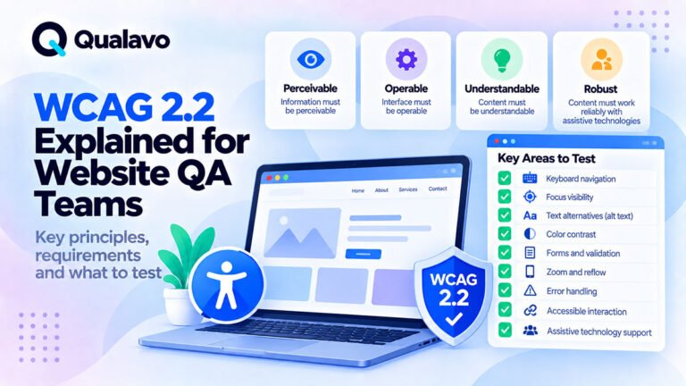
For a deeper explanation of the standard behind many accessibility requirements, see:
WCAG 2.2 Explained for Website QA Teams
Accessibility Should Be Part of Normal Website QA
Accessibility testing is often treated as a specialist activity performed only at the end of a project.
That creates unnecessary risk.
Many accessibility issues can be found during ordinary QA.
Examples:
- a button cannot be reached with Tab;
- focus disappears behind a modal;
- a form field has no visible label;
- an error is shown only in red;
- page content becomes unusable at high zoom;
- a mobile menu cannot be operated using a keyboard;
- heading levels are used incorrectly.
These are practical website defects.
They should be found as part of normal testing whenever accessibility is in scope.
Accessibility Testing Is Not the Same as a Formal Accessibility Audit
A practical QA accessibility pass can catch many important problems.
But it should not automatically be described as:
Full WCAG compliance testing.
A formal accessibility audit may require:
- systematic success-criterion evaluation;
- assistive technology testing;
- deeper screen reader testing;
- specialist review;
- documented conformance evidence.
A normal website QA process can still provide valuable accessibility coverage without making unsupported compliance claims.
Be precise about the scope.
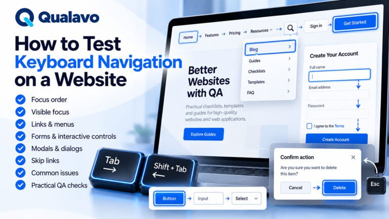
1. Test the Website Using Only a Keyboard
Keyboard testing is one of the most valuable manual accessibility checks.
Put the mouse aside.
Navigate using:
- Tab;
- Shift + Tab;
- Enter;
- Space;
- Arrow keys;
- Escape.
Test the main workflows.
Ask:
- Can I reach every important control?
- Can I activate buttons and links?
- Can I open menus?
- Can I use forms?
- Can I close dialogs?
- Can I complete the main user journey?
A workflow that requires a mouse may create a serious barrier.
2. Check Focus Visibility
As you tab through the page, you should be able to see which element currently has keyboard focus.
Look for:
- visible outline;
- background change;
- border;
- another clear focus indicator.
Problems include:
- no visible focus at all;
- extremely faint focus;
- focus removed by CSS;
- focus visible only on some controls.
At every step, ask:
Can I immediately tell where keyboard focus is?
If not, report the issue.
3. Check That Focus Is Not Hidden
Visible focus can still be inaccessible if another element covers it.
Common causes:
- sticky headers;
- cookie banners;
- fixed footers;
- chat widgets;
- overlays.
Example:
You Tab to a navigation link, but the sticky header completely covers the focused element.
The page technically moved focus.
The user still cannot see where they are.
This is particularly important under WCAG 2.2.
4. Check Focus Order
Keyboard focus should generally follow the logical order of the page.
For example:
Header → Navigation → Main Content → Form → Footer
Watch for:
- unexpected jumps;
- skipped controls;
- hidden elements receiving focus;
- footer links appearing before main content;
- focus moving behind a modal.
The DOM order and visual order should not create a confusing experience.
5. Test for Keyboard Traps
A keyboard trap occurs when users can move focus into part of the interface but cannot get out.
Common areas include:
- modals;
- custom dropdowns;
- embedded widgets;
- sliders.
Test whether:
- Tab continues logically;
- Shift + Tab works;
- Escape works where expected;
- users can exit the component.
A user should not become trapped in an interface element.
6. Check Main Navigation
Navigation is one of the most important accessibility areas.
Verify:
- menu can be reached;
- dropdowns can be opened;
- submenu items can be reached;
- focus remains visible;
- mobile menu can be operated;
- menu can be closed.
A navigation menu that works only on hover is particularly problematic.
7. Test Skip Links Where Applicable
Long pages may provide a: “Skip to main content” link.
Check:
- it becomes visible when focused;
- it works;
- it moves focus to the intended content.
Skip links can help keyboard and screen reader users avoid repeatedly moving through large navigation areas.
8. Check Heading Structure
Headings should reflect content hierarchy.
A typical structure might be:
H1 — Page title
H2 — Main section
H3 — Subsection
Avoid using heading levels purely for appearance.
Problems include:
- multiple unrelated H1s;
- jumping from H2 directly to H5 without reason;
- styling normal text as a heading;
- using headings only because the font size looks right.
Correct structure helps users understand and navigate the page.
9. Confirm the Page Has a Meaningful Title
The browser page title should describe the page.
Poor:
Page 4
Better:
Pricing | Example Company
Meaningful titles help:
- screen reader users;
- people with multiple browser tabs;
- search engines;
- general usability.
10. Check Link Text
Links should explain where they lead.
Avoid repeated vague links such as:
- Click here;
- More;
- Read;
- Learn.
Better:
Read the website launch checklist
or:
View Professional QA resources
Descriptive link text helps users understand destinations without relying entirely on surrounding content.
11. Check Links and Buttons Are Used Correctly
A useful general rule:
Links navigate somewhere.
Buttons perform an action.
Examples:
Use a link for:
View Pricing
Use a button for:
Open Menu
Custom interfaces sometimes use clickable <div> elements without proper keyboard behavior.
QA should test how controls behave, not only how they look.
12. Check Images and Alternative Text
Images should receive appropriate alternative-text treatment.
Ask:
- Does the image convey information?
- Is it decorative?
- Is it acting as a control?
Informative images should have useful alternative text.
Decorative images generally should not create unnecessary screen reader noise.
Poor alt text:
image123.jpg
Better:
QA dashboard showing open issues by severity
Avoid describing every tiny visual detail unless it helps communicate the image’s purpose.
13. Do Not Put Essential Information Only Inside Images
Important text should generally be available as real text.
Examples:
- pricing;
- instructions;
- warnings;
- contact details.
If meaningful information exists only inside an image, some users may not be able to access it effectively.
Infographics may also need appropriate supporting text.
14. Check Form Labels
Every important input should have an understandable label.
Examples:
Email Address
Password
Phone Number
Message
Do not rely only on placeholder text.
Placeholder text can:
- disappear after typing;
- have low contrast;
- make it difficult to remember what the field means.
Persistent labels are more reliable.
15. Check Required Fields
Users should understand which fields are required.
Do not rely only on color.
For example:
Better:
Email Address *
and include a clear explanation that * means required.
Or explicitly use:
Email Address — Required
The exact UI depends on the project.
The requirement should be understandable.
16. Test Form Errors
Submit invalid data intentionally.
Check:
- error message appears;
- message identifies the problem;
- message is associated with the relevant field;
- color is not the only indicator;
- keyboard user can locate the error.
Poor:
Invalid.
Better:
Enter a valid email address, for example name@example.com.
17. Check Error Summaries on Large Forms
Long forms may benefit from an error summary near the top.
For example:
There are 3 errors in this form.
with links to the affected fields.
This is especially useful when the invalid field is outside the current viewport.
18. Check Instructions Before the User Needs Them
If a field requires a special format, tell the user before they submit.
Example:
Password must contain at least 8 characters.
instead of revealing the requirement only after failure.
Clear instructions improve accessibility and general usability.
19. Test Color Contrast
Check important text and controls against their backgrounds.
Common problem areas include:
- gray text;
- disabled-looking buttons;
- light placeholder text;
- text over images;
- thin borders;
- subtle focus indicators.
Use an appropriate contrast checking tool.
Visual judgment alone is not reliable enough for precise contrast evaluation.
20. Do Not Use Color Alone
Information should not depend only on color.
Poor:
Green = Pass
Red = Fail
Better:
✓ Pass
✕ Fail
with both visual symbol and text.
Other examples include:
- required fields;
- chart categories;
- validation errors;
- status indicators.
21. Test Text Zoom
Increase browser zoom.
Check whether the website remains usable at larger zoom levels.
Look for:
- clipped text;
- overlapping content;
- inaccessible controls;
- broken navigation;
- hidden buttons;
- horizontal scrolling.
Users with low vision may depend heavily on zoom.
22. Check Reflow
At higher zoom or narrower viewports, content should reorganize rather than become unusable.
Check:
- columns;
- navigation;
- tables;
- forms;
- cards;
- modals.
Responsive design often helps, but responsive design alone does not guarantee accessible reflow.
23. Check Text Spacing
In accessibility-sensitive testing, increased:
- line height;
- letter spacing;
- word spacing;
should not destroy the layout.
Look for:
- clipped labels;
- overlapping buttons;
- hidden text.
This matters particularly in tightly designed components.
24. Test Mobile Accessibility
Accessibility QA should include mobile.
Test:
- mobile navigation;
- forms;
- buttons;
- zoom;
- touch targets;
- modals;
- fixed elements.
A page that works well on desktop may still have accessibility problems on mobile.
25. Check Touch Target Size
Very small targets can be difficult for users with limited motor control.
Common problems include:
- tiny close icons;
- closely spaced pagination;
- small checkboxes;
- compact icon-only controls.
QA should consider both:
- size;
- spacing around controls.
This is especially important on mobile.
26. Test Orientation Where Relevant
If the website or application is intended to work in both:
- portrait;
- landscape;
check whether important workflows remain usable.
Watch for:
- clipped content;
- hidden buttons;
- modal overflow;
- unusable navigation.
27. Test Modals and Dialogs
Modals are a frequent accessibility problem area.
When opening a modal, check:
- focus moves appropriately;
- keyboard focus remains within the modal when required;
- focus does not move behind it;
- close control is accessible;
- Escape works where expected;
- focus returns logically after closing.
Also check whether users can understand that a dialog has opened.
28. Test Dropdowns
Custom dropdowns should be tested carefully.
Verify:
- keyboard can reach them;
- options are operable;
- focus remains visible;
- selected state is understandable;
- Escape or closing behavior works.
Native dropdowns usually provide stronger accessibility by default than poorly built custom controls.
29. Test Accordions
Check:
- headers are operable by keyboard;
- expanded/collapsed state is clear;
- hidden content is handled properly;
- focus order remains logical.
30. Test Tabs
For tab interfaces, verify:
- active tab is identifiable;
- keyboard interaction works;
- associated content changes correctly;
- focus behavior is logical.
Do not assume visually styled buttons automatically behave like accessible tabs.
31. Check Video Content
Where videos contain meaningful information, check whether accessibility support is appropriate.
Depending on content, this may include:
- captions;
- transcript;
- audio description.
At minimum, avoid videos that communicate essential information only through inaccessible audio or visuals.
32. Check Autoplay
Automatically playing:
- video;
- audio;
- animation;
can create usability and accessibility problems.
Users should generally have control over significant moving or audible content.
Check whether:
- playback can be paused;
- audio can be stopped;
- unexpected sound begins automatically.
33. Check Moving and Animated Content
Animations may create problems for some users.
Check whether important animation:
- can be paused;
- is necessary;
- blocks interaction;
- flashes rapidly;
- causes content to become difficult to follow.
Avoid unnecessary motion where it reduces usability.
34. Check Tables
Data tables should be understandable.
Check:
- header cells are clear;
- rows/columns make sense;
- layout remains usable on mobile;
- table does not become impossible to navigate.
Complex tables may require more specialized accessibility review.
35. Check Lists
Use true list structures for actual lists.
For example:
- bullet lists;
- numbered steps;
- navigation groups.
Visual bullets created only with manual characters may not communicate structure as effectively.
36. Check Language
The page should define its primary language correctly.
This helps assistive technology pronounce content appropriately.
Also review major language changes inside content where relevant.
37. Check Accessible Names for Icon Buttons
Icon-only controls need understandable names.
Examples:
- search icon;
- close button;
- menu icon;
- share button.
A screen reader should not announce:
button
with no useful context.
It should communicate the purpose.
For example:
Close dialog
38. Check CAPTCHA
CAPTCHA can create accessibility barriers.
If CAPTCHA is used, verify whether users have an accessible alternative.
Also test:
- keyboard behavior;
- error handling;
- timeout;
- reset behavior.
39. Test Authentication Accessibility
Login and account recovery deserve special attention.
Check:
- labels;
- password fields;
- show/hide password;
- error messages;
- CAPTCHA;
- verification;
- password reset.
For the full authentication guide:
How to Test Login, Signup and Password Reset Flows
40. Test Checkout Accessibility
E-commerce checkout should be usable without relying on a mouse.
Check:
- cart controls;
- checkout fields;
- shipping options;
- payment fields;
- error messages;
- confirmation.
A checkout accessibility barrier can directly prevent purchase completion.
For broader checkout QA:
How to Test an E-commerce Checkout Flow
41. Check Search
If the website includes search, verify:
- search field has a clear label;
- keyboard use works;
- results are understandable;
- empty results are handled;
- result links are meaningful.
42. Check Breadcrumbs
Breadcrumbs should:
- make hierarchy understandable;
- contain usable links;
- identify the current location appropriately.
They can improve navigation for many users.
43. Check Status Messages
Some changes happen without a page reload.
Examples:
- item added to cart;
- form successfully submitted;
- validation error;
- loading complete.
Users of assistive technology should receive appropriate feedback.
A visual toast message alone may not always be enough.
44. Check Loading States
If the interface loads asynchronously, verify:
- user understands something is happening;
- controls do not become confusing;
- loading state does not trap focus;
- final result is understandable.
45. Check Responsive Tables and Complex Components
Responsive design can introduce accessibility defects.
Examples:
- table becomes horizontally unusable;
- labels disappear;
- controls become icon-only;
- desktop information is removed on mobile.
Verify that the mobile version preserves meaningful information.
46. Use Automated Accessibility Testing
Automated tools can help detect issues such as:
- missing labels;
- certain contrast failures;
- invalid ARIA;
- structural problems;
- missing alternative text.
Automation is useful because it is:
- fast;
- repeatable;
- scalable.
But it should not be the only accessibility test.
47. Do Not Treat an Automated Score as Accessibility
A high automated accessibility score does not prove the page is accessible.
Automated tools cannot reliably judge everything.
For example:
An image may have:
alt="image"
The tool may detect that alt text exists.
A human still needs to decide whether it is useful.
Similarly, automation may not understand whether:
- focus order makes sense;
- navigation is predictable;
- form instructions are understandable.
48. Perform Basic Screen Reader Sanity Testing Where Appropriate
For important workflows, a basic screen reader check can reveal major issues.
Examples:
- page headings;
- navigation;
- form labels;
- buttons;
- error messages.
Screen reader testing requires skill.
If formal accessibility assurance is required, experienced accessibility testers should be involved.
49. Test More Than the Homepage
Do not perform accessibility QA only on the homepage.
Include representative templates and critical workflows.
Examples:
- homepage;
- content page;
- contact form;
- pricing;
- login;
- checkout;
- modal-heavy page;
- account screen.
Testing one page cannot prove the entire website is accessible.
50. Prioritize Critical User Journeys
If time is limited, start with workflows users must be able to complete.
Examples:
Lead Generation
Homepage → Service → Contact Form
E-commerce
Product → Cart → Checkout
SaaS
Signup → Login → Core Action
Accessibility defects in critical journeys create greater user impact.
A Practical Website Accessibility Testing Checklist
Keyboard
- Main functionality works without a mouse.
- All important controls are reachable.
- Focus is visible.
- Focus order is logical.
- No keyboard trap exists.
- Focus is not hidden by fixed content.
Navigation
- Main menu is keyboard accessible.
- Mobile menu is accessible.
- Link text is meaningful.
- Skip link works where provided.
Structure
- Page title is meaningful.
- H1/H2/H3 hierarchy is logical.
- Lists use appropriate structure.
- Tables are understandable.
Images and Media
- Informative images have useful alt text.
- Decorative images do not create unnecessary noise.
- Important information is not image-only.
- Video accessibility support is appropriate.
Forms
- Inputs have labels.
- Required fields are clear.
- Errors explain what needs correction.
- Errors do not rely only on color.
- Form can be completed with a keyboard.
Visual Accessibility
- Text contrast is checked.
- Important UI contrast is checked.
- Color is not the only information channel.
- Focus indicator is visible.
Zoom and Responsive Behavior
- Page remains usable when zoomed.
- Content reflows appropriately.
- No important text is clipped.
- Mobile layout remains accessible.
- Touch targets are usable.
Components
- Modals work with keyboard.
- Dropdowns are accessible.
- Accordions behave correctly.
- Tabs work logically.
- Icon buttons have understandable names.
Authentication and Transactions
- Login is accessible.
- Password reset is accessible.
- Checkout is accessible where applicable.
- CAPTCHA has an appropriate alternative.
Testing Process
- Automated checks were completed.
- Manual keyboard testing was completed.
- Critical workflows were tested.
- Issues were documented and retested.
Prioritize Accessibility Defects by Impact
Not every issue has the same effect.
High Impact Examples
- checkout cannot be completed with a keyboard;
- navigation cannot be accessed;
- login controls have no usable labels;
- modal traps keyboard users.
Medium Impact Examples
- focus order is confusing;
- important text has insufficient contrast;
- errors are difficult to locate.
Lower Impact Examples
- minor heading hierarchy issue on a secondary page;
- small accessibility inconsistency with limited functional impact.
Severity should reflect real user impact.
Document Accessibility Defects Clearly
Accessibility bugs should still use the normal defect process.
Example:
Title: Checkout payment button cannot be reached using keyboard
Environment: Safari / macOS
Steps:
- Add product to cart.
- Open checkout.
- Navigate using Tab only.
- Continue through payment fields.
Expected Result:
Keyboard focus should reach the payment button.
Actual Result:
Focus skips directly from the final payment field to the footer.
Severity: High
This makes the issue clear to development.
For defect structure:
Bug Report Template: What Every Defect Report Should Include
Retest Accessibility Fixes
Do not close accessibility defects based only on visual review.
If the issue involved:
- keyboard;
- focus;
- screen reader output;
- zoom;
retest using the same accessibility method.
Example:
If the original problem was:
Modal cannot be closed with keyboard
then retest using the keyboard.
Do not verify only that the close button now looks correct.
Include Accessibility in Release Readiness
Before launch, ask:
- Were agreed accessibility checks completed?
- Do any critical barriers remain?
- Can primary workflows be completed?
- Were high-impact defects retested?
If accessibility requirements are contractual, regulatory, or essential to the client, unresolved issues may influence the release decision.
For release readiness:
Go/No-Go Checklist: Is Your Website Ready to Launch?
Report Accessibility Scope Accurately
Avoid:
Website is fully accessible.
or:
WCAG compliant.
unless the required formal evaluation supports those claims.
Prefer:
Accessibility QA included keyboard navigation, focus behavior, forms, contrast, heading structure, zoom/reflow, and basic automated checks.
This tells the client what was actually done.
Make Accessibility QA Repeatable
Accessibility checks should not depend on someone remembering them before launch.
Use a repeatable process:
Automated Check → Keyboard Test → Forms → Visual Accessibility → Zoom/Reflow → Components → Critical Journeys → Report → Retest
This creates a practical baseline for future releases.
Qualavo Professional includes structured accessibility testing resources as part of its advanced website QA workflow.
Final Thoughts
Website accessibility testing does not need to begin with a massive audit.
Start with practical checks that reveal real barriers:
keyboard navigation, focus, forms, contrast, headings, images, zoom, mobile behavior, and critical user journeys.
Use automated tools to help find technical issues.
Use manual testing to understand actual usability.
And involve accessibility specialists when the project requires formal or deeper assurance.
The objective is not simply to pass a checklist.
It is to make sure more people can successfully use the website.
Need a structured QA workflow that includes deeper accessibility testing? Explore Qualavo Professional.