How to Test Keyboard Navigation on a Website
Why Keyboard Navigation Testing Matters
A website should not require a mouse to complete essential tasks.
Many users navigate websites with a keyboard because of mobility impairments, temporary injuries, assistive technology, personal preference, or because a mouse or touchscreen is not practical in their situation.
Keyboard accessibility is therefore an important part of website QA.
A website may look visually correct and work perfectly with a mouse while still containing serious accessibility problems.
For example, a keyboard user may be unable to open the navigation menu, reach a form field, activate a button, close a modal, or determine which element currently has focus.
The basic question is simple:
Can someone use the important parts of this website with the keyboard alone?
For a broader accessibility framework, see Website Accessibility Testing Checklist: A Practical QA Guide.
Keyboard Testing Is More Than Pressing Tab
The Tab key is central to keyboard testing, but complete keyboard QA involves more than tabbing through links.
Depending on the component, users may also rely on:
Shift + Tab to move backward, Enter to activate links or controls, Space to activate certain buttons or controls, Arrow keys to navigate particular widgets, and Escape to close menus, dialogs, or overlays where appropriate.
The exact keyboard behavior depends on the control.
The goal is not to force every element to respond to every key.
The goal is to make sure each interactive component behaves in a predictable and accessible way.
Start Without the Mouse
One of the simplest accessibility tests is also one of the most revealing.
Load the page.
Then stop using the mouse.
Navigate the page entirely with the keyboard.
Ask yourself:
Can I tell where I am?
Can I reach every important interactive element?
Can I activate it?
Can I get out again?
This quickly exposes problems that can remain invisible during normal mouse-based testing.
Understand What Keyboard Focus Means
Keyboard focus identifies the element that currently receives keyboard input.
When you press Tab, focus typically moves to the next interactive element.
That might be:
a link, button, form field, checkbox, menu control, or another focusable component.
The browser normally provides a visible indication of focus.
Websites may customize this appearance.
What matters is that the user can reliably see which element is active.
A keyboard interface without visible focus is similar to using a mouse when the pointer is invisible.
Check That Focus Is Visible
Begin by pressing Tab from the top of the page.
Watch each element that receives focus.
The current element should have a clear visual state.
This might be:
an outline, border, background change, underline, or another sufficiently obvious visual treatment.
A very faint color shift may not be enough.
Users should not have to guess where focus is.
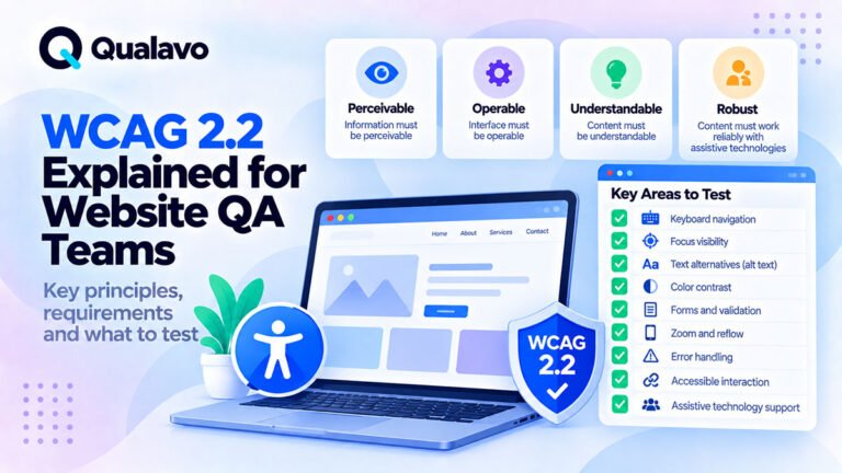
For the broader relationship between accessibility requirements and QA, see WCAG 2.2 Explained for Website QA Teams.
Look for Removed Focus Indicators
One common accessibility problem occurs when CSS removes the browser’s default focus outline.
For example, a design may intentionally suppress the outline to make buttons look cleaner.
The result can be:
mouse interaction works normally, but keyboard users cannot see their position.
Custom focus styling is completely acceptable.
Removing visible focus without providing an equivalent replacement is not.
During QA, check important links, buttons, navigation items, fields, and custom controls.
Test the Focus Order
Keyboard focus should normally follow a logical sequence.
A typical page might move through:
Header → Navigation → Main Content → Form or CTA → Related Content → Footer
Focus should not unexpectedly jump:
from the header to the footer,
back to the navigation,
then into the middle of the page.
The order should broadly follow the visual and semantic structure of the interface.
Compare Visual Order With Keyboard Order
Responsive and grid-based layouts can create a mismatch between visual position and DOM order.
Imagine three cards displayed visually as:
Card A → Card B → Card C
But keyboard focus moves:
Card A → Card C → Card B
That may be confusing.
During testing, compare where elements appear on screen with the order in which focus reaches them.
This is particularly important after layout changes involving CSS Grid, Flexbox, or responsive rearrangement.
For broader responsive coverage, see Responsive Website Testing Checklist for Desktop, Tablet and Mobile.
Test Forward and Backward Navigation
Do not test only Tab.
Use Shift + Tab to move backward.
A user should be able to navigate in both directions without:
losing focus, becoming trapped, skipping important controls, or jumping to unexpected parts of the page.
Backward navigation is particularly useful for finding issues inside:
modals, dropdowns, menus, and complex forms.
Check Every Important Link
Links should normally be reachable with the keyboard.
Once focused, they should be activatable using the expected keyboard interaction.
Test important links such as:
navigation items, content links, breadcrumbs, pagination, footer links, and prominent CTAs.
If a clickable element works only through a mouse event and cannot receive keyboard focus, it may be inaccessible.
Check Every Button
Buttons are another critical area.
Verify that keyboard users can reach and activate:
form submit buttons, menu buttons, modal controls, carousel controls, filters, account actions, and other interactive elements.
Custom controls built from non-semantic HTML are particularly likely to fail keyboard tests.
A component may look exactly like a button while not behaving like one.
Test the Main Navigation
Navigation is one of the first areas to test.
Start at the top of the page and move through the navigation using the keyboard.
Verify that:
focus remains visible, links are reachable, dropdown triggers can be operated, submenu options can be reached, and the user can continue beyond the menu.
A keyboard user should not need a mouse simply to navigate to another page.
Test Dropdown Navigation
Dropdown menus can create several types of keyboard problems.
A submenu might appear only on mouse hover.
The trigger might not receive focus.
The submenu might open but its links may not be reachable.
Or focus may unexpectedly disappear when the submenu closes.
Test the entire interaction from opening the menu to selecting an option and leaving the menu.
Do not assume a working hover menu is keyboard accessible.
Test Mobile Navigation Too
Responsive navigation often uses a different implementation.
A desktop menu may become a hamburger menu on smaller screens.
That means desktop keyboard testing does not automatically prove the responsive menu is accessible.
Check whether the menu trigger receives focus, whether it can be activated by keyboard, whether menu items can be reached, and whether users can close the menu and return to the page.
Responsive states should be included in accessibility QA rather than tested separately only for visual layout.
Test Skip Links
Many accessible websites provide a Skip to content or similar link near the beginning of the page.
It may become visible only after keyboard focus reaches it.
This lets keyboard users bypass repeated navigation and move directly to the main content.
If the site includes a skip link, test that:
it becomes visible appropriately, can be activated, moves focus to the intended destination, and does not simply scroll visually while leaving keyboard focus elsewhere.
Test Forms With Keyboard Only
Forms are one of the highest-value areas for keyboard QA.
Complete an entire important form without using the mouse.
Move through:
labels, text fields, dropdowns, checkboxes, radio buttons, date fields, file uploads, and the submit button.
The full workflow should remain understandable and usable.
For pre-launch functional coverage around forms and other critical workflows, see How to Test a Website Before Launch: A Step-by-Step QA Process.
Verify Form Focus Order
Form fields should normally follow the logical order users see on screen.
For example:
Name → Email → Phone → Message → Submit
A sequence such as:
Name → Submit → Email → Footer → Phone
would be highly confusing.
This type of problem can happen when layout order differs from source order or when custom tabindex values are used poorly.
Test Checkboxes and Radio Buttons
Checkboxes and radio buttons should work without a mouse.
Verify that users can:
reach the control, identify the focused state, change its value using the expected keyboard interaction, and understand which option is selected.
Custom-styled versions deserve particular attention because visual replacements can sometimes break native keyboard behavior.
Test Select and Dropdown Fields
Native select elements generally provide strong keyboard support automatically.
Custom dropdowns require more careful testing.
Check whether the user can:
reach the control, open it, navigate available choices, select an option, and leave the component.
Also test long option lists where scrolling may be required.
Test Validation Errors
A form that works with valid input may become difficult to use once validation errors appear.
Submit the form with required fields missing.
Then continue with the keyboard.
Ask:
Where does focus go?
Can the user identify the problem?
Can the user reach the invalid field?
Is the validation message visible and associated with the relevant control?
Accessibility problems often appear only during failure states.
Test Login and Signup Forms
Authentication is usually a critical user journey.
Keyboard-test:
login, signup, password reset, email verification flows, and related dialogs.
The user should not become blocked because authentication requires a mouse-only interaction.
For deeper functional testing around these workflows, see How to Test Login, Signup and Password Reset Flows.
Test Modals and Dialogs
Modals are one of the most common sources of keyboard accessibility defects.
When a modal opens, keyboard focus should generally move into the dialog or otherwise be managed appropriately.
The user should be able to interact with the modal without accidentally tabbing through unrelated content behind it.
When the modal closes, focus should return to a sensible place, often the control that opened it.
Look for Keyboard Traps
A keyboard trap occurs when the user enters a component and cannot navigate away using normal keyboard controls.
This can make part or all of a website unusable.
Common places to look include:
modals, embedded content, custom menus, carousels, date pickers, and third-party widgets.
A modal may intentionally keep focus inside itself while open.
That is different from an accidental trap because the user should still have a clear way to close the modal and return to the page.
Test the Escape Key Where Appropriate
Components such as modals, popovers, menus, or overlays may support Escape to close.
Where that behavior is expected, test it.
After closing the component, check the resulting focus position.
The interface should not leave focus:
behind the page, on a removed element, or in an unpredictable location.
Test Focus When a Modal Closes
Suppose the user activates:
View Details
and a modal opens.
When it closes, focus should ideally return to a meaningful position — often View Details.
If focus resets to the top of the page, keyboard users may need to navigate through dozens of controls again.
Focus restoration is therefore an important usability detail.
Test Popups and Cookie Banners
Cookie banners, newsletter popups, consent dialogs, and promotional overlays can interfere with keyboard navigation.
Verify that users can:
reach them, make a selection, close them where permitted, and continue navigating the website.
Also verify that overlays do not create an invisible focus trap.
Third-party widgets should not be excluded from QA simply because another provider created them.
Test Accordions
Accordion controls should be reachable and operable with the keyboard.
Check:
closed state, open state, repeated opening and closing, multiple accordion items, and focus behavior after interaction.
The user should understand which section is active.
Test Tabs
Tab interfaces can require more specific keyboard behavior than ordinary links.
Depending on implementation, users may move between tab controls using arrow keys and activate or select panels using standard accessible interaction patterns.
The important QA question is whether the component can be understood and operated without a mouse.
Custom tab components deserve targeted testing.
Test Carousels
Carousels may include:
previous/next buttons, slide indicators, autoplay controls, and content links.
Keyboard users should be able to interact with necessary controls.
Be particularly cautious of autoplay behavior that constantly changes content or moves focus unexpectedly.
Focus should never jump automatically simply because the carousel advances.
Test Search and Filters
Modern websites may contain complex search interfaces.
Keyboard-test:
search field, suggestions, filters, sorting, clear controls, and result pagination.
Autocomplete and custom dropdown components deserve special attention because they can introduce complicated focus behavior.
For SaaS applications, the same principle applies to data tables, filters, multi-select controls, and advanced search interfaces.
Test Pagination
Pagination links or buttons should be keyboard accessible.
Verify:
page numbers, Previous, Next, and other navigation controls.
After changing pages, consider where focus lands.
A user should not be forced into an unnecessarily confusing navigation loop.
Test Tables With Interactive Controls
A normal data table containing only information may require little keyboard interaction.
A SaaS-style table may contain:
checkboxes, links, action menus, buttons, filters, sorting controls, or inline editing.
Keyboard-test the interactive elements in a representative row.
Check whether the focus order remains understandable when dozens of controls appear on the page.
Test Custom Multi-Select Controls
Multi-selects are often significantly more complex than native inputs.
Verify that keyboard users can:
reach the component, open it, navigate options, select items, remove selected items, close the list, and continue to the next control.
If selected items are shown as removable pills or badges, their remove actions must also be usable.
Test Date Pickers
A date field may allow direct typing, a calendar widget, or both.
Check whether keyboard users can complete the required task.
A calendar that can only be operated with a mouse can create a serious barrier, especially if direct date input is unavailable.
Test File Upload Controls
If users need to upload:
documents, images, resumes, or other files,
make sure the file upload workflow can be reached and initiated from the keyboard.
Custom drag-and-drop interfaces should not make file selection impossible for keyboard users.
Test Important Calls to Action
Identify the page’s most important action.
It might be:
Buy Now
Start Free Trial
Contact Us
Submit
Book Appointment
Start Checkout
Then verify that the action can be reached and activated without a mouse.
If a keyboard problem blocks the primary CTA, its business impact may be much greater than a minor accessibility issue elsewhere.
Test E-commerce With Keyboard Only
For an online store, run a representative purchase journey using the keyboard.
For example:
Product → Variant → Add to Cart → Cart → Checkout
Test relevant controls such as:
quantity, coupon, shipping options, payment selection, and order submission.
For broader transaction QA, see E-commerce Website Testing Checklist: What to Test Before Launch.
Test the Shopping Cart
Shopping carts often combine multiple interactive components in a small space.
Check:
quantity controls, remove actions, coupon controls, product links, and checkout.
For broader cart coverage, see Shopping Cart Testing: Common Issues and QA Checks.
An inaccessible checkout button can turn an otherwise minor keyboard issue into a revenue-impacting defect.
Test SaaS Critical Workflows
SaaS applications often contain far more interactive controls than normal content websites.
Test keyboard behavior in:
navigation, forms, CRUD workflows, tables, filters, modals, account settings, and other critical actions.
For a broader framework, see SaaS QA Checklist: What to Test in a Web Application.
Do not try to keyboard-test every obscure feature first.
Use risk to prioritize the workflows users depend on most.
Check Role-Specific Interfaces
Different user roles may see different controls.
An Administrator may have action menus that a Viewer does not.
Keyboard accessibility should therefore be checked against representative roles where the interface changes substantially.
For role-related SaaS coverage, see Role and Permission Testing for SaaS Applications.
Test WordPress Websites After Major UI Changes
WordPress themes, plugins, page builders, and custom blocks can alter keyboard behavior.
Navigation plugins, modal plugins, form plugins, cookie systems, and accessibility-related scripts may all influence focus handling.
For a broader WordPress framework, see WordPress QA Checklist: What to Test Before Going Live.
If a plugin update affects interactive components, include keyboard regression testing in the update QA cycle.
Do Not Forget Dynamic Content
Modern sites frequently change content without a full page reload.
Examples include:
AJAX results, validation messages, shopping-cart updates, notifications, and dynamically loaded modal content.
After the interface changes, verify that keyboard focus remains sensible.
A new element appearing visually does not automatically mean the keyboard user knows it appeared.
Watch for Focus Disappearing
A particularly confusing defect occurs when the currently focused element is removed from the DOM.
For example:
a user activates Delete, the row disappears, and focus effectively disappears with it.
The application should ideally move focus to a sensible remaining location.
Dynamic applications need deliberate focus management.
Watch for Unexpected Focus Movement
Focus should not jump around the page unexpectedly.
Examples of problematic behavior include:
typing into a field and focus suddenly moving elsewhere, opening a notification and focus automatically jumping into it, or an auto-rotating component moving focus.
Users should remain in control of navigation.
Test Keyboard Navigation After Responsive Changes
A component may use completely different markup at different breakpoints.
For example:
desktop navigation → mobile drawer
or:
desktop table → mobile cards.
That means keyboard accessibility should be verified in both relevant responsive states.
Visual responsive QA alone cannot guarantee accessible interaction.
Test Browser Differences Where Relevant
Keyboard behavior is generally standardized, but custom JavaScript components may behave differently between browsers.
If a critical component has complex keyboard behavior, include it in the project’s supported browser coverage.
For environment planning, see Browser and Device Test Matrix: How to Choose What to Test.
Do Not Use Tabindex to Hide a Broken Structure
QA testers may encounter unusual focus orders caused by custom tabindex values.
Positive tabindex values can create artificial focus sequences that become difficult to maintain.
From a QA perspective, you do not necessarily need to prescribe the implementation fix.
Report the user-visible problem:
Keyboard focus order does not follow the logical page sequence.
Developers can then determine the correct technical solution.
Keyboard Testing and Screen Reader Testing Are Not the Same Thing
Keyboard accessibility and screen-reader accessibility overlap, but they are not interchangeable.
A page can have good keyboard behavior while containing poor semantic structure.
A page can also have meaningful screen-reader labels while containing a keyboard trap.
Keyboard QA is therefore one layer of accessibility testing.
It does not replace the rest of the accessibility process.
Manual Testing Is Essential
Automated accessibility tools are useful.
They can identify many structural issues.
But automated scanning cannot reliably determine whether a real keyboard navigation sequence is practical and understandable.
A tester needs to interact with the interface.
This is especially true for:
focus order, focus visibility, modals, menus, custom components, and dynamic workflows.
How to Report a Keyboard Accessibility Bug
A useful report should identify both the control and the keyboard interaction.
For example:
Title: Keyboard focus cannot reach Checkout button in mobile cart
Environment: Chrome / Windows
Page: Cart
Steps: Open the cart, press Tab repeatedly until the quantity controls receive focus, then continue navigating toward checkout.
Expected: Focus reaches the Checkout button and the button can be activated with the keyboard.
Actual: Focus skips the Checkout button completely.
For the general defect structure, see Bug Report Template: What Every Defect Report Should Include.
Include the Exact Key Used
Keyboard defects are easier to reproduce when the report identifies the interaction.
For example:
Tab
Shift + Tab
Enter
Space
Escape
Arrow Down
Do not write only:
Menu doesn’t work with keyboard.
Explain how it fails.
Severity Depends on User Impact
Not every keyboard issue has the same impact.
A focus indicator missing on a rarely used secondary link may have a different severity from a keyboard trap preventing users from completing checkout.
Consider:
the importance of the workflow, how completely the interaction is blocked, whether a workaround exists, and how many users or pages are affected.
For general defect classification, see Bug Severity vs Priority: What’s the Difference?.
Some Keyboard Defects Can Block a Release
A keyboard issue can become release-critical if it prevents users from completing an essential workflow.
Examples may include:
a checkout that cannot be completed, an essential form that cannot be submitted, a modal that traps users with no escape, or primary navigation that is inaccessible through the keyboard.
For the broader release decision framework, see Which Bugs Should Block a Website Release?.
Use Risk-Based Accessibility Testing
If the website is large, prioritize keyboard testing around:
critical navigation, authentication, forms, checkout, account functions, high-traffic templates, and complex custom controls.
Then expand coverage to lower-risk components.
For the wider methodology, see Risk-Based Testing: How to Prioritize What Matters Most.
This provides stronger coverage than spending equal time on every element.
Retest the Complete Interaction After a Fix
Suppose a developer fixes keyboard access to a modal’s close button.
Do not test only whether the close button now receives focus.
Run the complete interaction:
Open Modal → Navigate Through Modal → Close → Verify Returned Focus
Accessibility defects often involve a sequence rather than a single element.
Run Regression Around Shared Components
A change to a shared navigation component may affect every page.
A change to a reusable modal may affect many workflows.
After fixing shared accessibility components, test them on representative pages and responsive states.
The regression scope should reflect the potential impact of the change.
A Practical Keyboard Navigation Checklist
Use this as a baseline for important pages and user journeys:
- The page can be navigated without a mouse.
- Focus is always visible.
- Focus order is logical.
- Shift + Tab works in reverse.
- Important links are reachable.
- Buttons can be activated.
- Navigation is keyboard accessible.
- Dropdown menus are usable.
- Mobile navigation is usable.
- Skip links work where provided.
- Forms can be completed.
- Checkboxes and radio buttons work.
- Custom selects are operable.
- Validation errors remain usable.
- Modals manage focus correctly.
- Users can exit dialogs and overlays.
- No accidental keyboard traps exist.
- Accordions are usable.
- Tabs are usable.
- Carousels do not cause unexpected focus changes.
- Search and filters are usable.
- Pagination is accessible.
- Important tables and action menus are usable.
- Date pickers can be operated.
- File uploads remain accessible.
- Dynamic updates do not lose focus.
- Critical CTAs can be reached and activated.
- Responsive states preserve keyboard access.
- Critical fixes receive regression testing.
A Simple Keyboard Test Sequence
For a typical page, a practical manual workflow is:
Load Page → Press Tab → Follow Focus → Activate Controls → Test Reverse Navigation → Open Interactive Components → Close Them → Complete Critical Form or CTA → Continue to Footer
Record anything that:
cannot be reached, cannot be activated, has invisible focus, creates illogical navigation, traps the user, or moves focus unexpectedly.
This simple process can reveal surprisingly serious usability problems.
Keyboard Accessibility Should Be Part of the Normal QA Process
Keyboard testing should not be treated as an isolated accessibility exercise performed once and forgotten.
Important keyboard checks can be included in:
pre-launch QA, regression testing, plugin updates, responsive testing, and post-change verification.
When a release adds a new interactive component, ask:
Can a keyboard user operate this?
That one question catches a large class of accessibility defects before production.
Connect Keyboard Testing to Release Readiness
Before launch, verify that critical workflows do not contain unresolved keyboard blockers.
A release-readiness review should consider accessibility alongside:
functional defects, browser coverage, integrations, security sanity checks, and other known risks.
For the wider decision framework, see What Is Release Readiness? A Guide to Website Launch Decisions.
If a serious keyboard defect remains, document its impact rather than silently treating accessibility testing as complete.
Include Keyboard QA in Production Smoke Testing When Necessary
Most accessibility testing should happen before deployment.
However, if a release changes navigation, forms, modals, or another critical interactive component, a short production verification can be valuable.
Confirm that deployment-specific assets or JavaScript optimization did not break keyboard behavior.
For the wider production process, see Post-Deployment Smoke Testing: What to Check After Release.
Build Keyboard Testing Into a Repeatable Accessibility Workflow
A practical process is:
Identify Critical User Journeys → Navigate With Keyboard Only → Check Focus Visibility → Verify Focus Order → Test Interactive Components → Test Failure States → Report Defects → Retest → Run Relevant Regression
This makes keyboard testing systematic rather than dependent on someone remembering to press Tab shortly before launch.
For teams that need structured website accessibility checks together with broader QA planning, browser/device coverage, SaaS, WordPress, security sanity testing, release readiness, and reporting, Qualavo QA Professional provides a more complete QA workflow.
Final Thoughts
Keyboard navigation testing is one of the simplest manual accessibility techniques, but it can reveal serious usability problems.
You do not need specialized hardware to begin.
Start with the keyboard and ask:
Can I reach it?
Can I see where focus is?
Can I activate it?
Can I leave it?
Does the navigation order make sense?
Pay particular attention to navigation, forms, authentication, modals, dropdowns, custom controls, checkout, and other critical user journeys.
Test both forward and backward navigation.
Look for invisible focus, skipped controls, unexpected focus movement, and keyboard traps.
And remember that keyboard accessibility is not simply a technical checkbox.
For users who cannot rely on a mouse, it determines whether the website is usable at all.