WCAG 2.2 Explained for Website QA Teams
What Is WCAG 2.2?
WCAG 2.2 stands for Web Content Accessibility Guidelines 2.2.
It is a technical accessibility standard published by the World Wide Web Consortium’s Web Accessibility Initiative.
WCAG provides testable requirements for making websites and web applications more accessible to people with disabilities.
For QA teams, WCAG is useful because it turns a broad goal such as:
“Make the website accessible.”
into specific requirements that can be reviewed and tested.
These requirements cover areas such as:
- keyboard navigation;
- focus visibility;
- text alternatives;
- forms;
- color contrast;
- page structure;
- zoom and reflow;
- error handling;
- authentication;
- target sizes;
- consistent interaction.
WCAG does not replace usability testing or testing with people who use assistive technologies.
It provides a structured accessibility baseline.
Why WCAG Matters to Website QA Teams
Accessibility should not be treated as something that happens only during design or at the end of a project.
Many accessibility issues are functional defects.
For example:
- a menu cannot be opened with a keyboard;
- focus disappears behind a sticky header;
- a form error is communicated only by color;
- a button has no accessible name;
- content becomes unusable at higher zoom;
- a modal traps keyboard focus incorrectly;
- a control is too small to activate reliably.
These are exactly the kinds of issues QA teams are well positioned to identify.
Adding accessibility checks to an existing QA workflow improves consistency and helps prevent obvious barriers from reaching production.
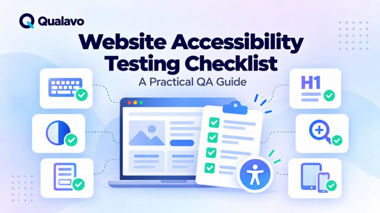
For a practical testing starting point, see:
Website Accessibility Testing Checklist: A Practical QA Guide
The Four WCAG Principles: POUR
WCAG is organized around four accessibility principles.
A website should be:
Perceivable
Operable
Understandable
Robust
These are commonly remembered as POUR.
1. Perceivable
Users must be able to perceive the information being presented.
Content should not depend on one sensory method alone.
Examples include:
- images need appropriate text alternatives;
- video content may require captions;
- information should not rely only on color;
- text should have sufficient contrast;
- content should remain usable when resized or zoomed.
From a QA perspective, this means asking:
- Can users understand the page without seeing every visual element?
- Does important information remain available when presentation changes?
- Is content readable under realistic accessibility conditions?
2. Operable
Users must be able to operate the interface.
This is particularly important for people who cannot use a mouse.
QA checks may include:
- keyboard navigation;
- focus order;
- visible focus indicators;
- modals;
- dropdowns;
- menus;
- interactive controls;
- touch target size.
A visually correct page can still fail accessibility if users cannot reach or operate its controls.
3. Understandable
Content and interactions should behave in ways users can understand.
Examples include:
- labels should be clear;
- errors should explain what went wrong;
- navigation should remain reasonably consistent;
- forms should not behave unpredictably;
- instructions should be understandable.
For QA teams, this overlaps strongly with functional testing and usability review.
4. Robust
Content should work reliably with different browsers, platforms, and assistive technologies.
Robustness often depends on:
- valid semantic HTML;
- correctly implemented controls;
- meaningful accessible names;
- appropriate ARIA usage;
- compatible component behavior.
QA teams do not always need to audit the full codebase to identify robustness issues.
Testing with browser accessibility tools, keyboard interaction, and representative assistive technology can reveal many problems.
WCAG Conformance Levels: A, AA and AAA
WCAG success criteria are assigned one of three levels.
Level A
These are foundational accessibility requirements.
Failure can create significant barriers.
Examples may involve:
- missing text alternatives;
- keyboard access;
- form labeling;
- basic structure.
Level AA
Level AA builds on Level A and covers many of the accessibility requirements commonly targeted by websites and organizations.
Typical areas include:
- contrast;
- focus visibility;
- reflow;
- accessible interaction;
- error handling.
For many commercial website projects, teams use WCAG 2.2 Level AA as the practical target.
Level AAA
Level AAA contains more demanding requirements.
It is generally not realistic to assume that every page of every website can or should satisfy every AAA criterion.
AAA criteria can still provide useful guidance for improving accessibility beyond a standard AA target.
What Changed in WCAG 2.2?
WCAG 2.2 builds on WCAG 2.1 rather than replacing its overall structure.
One of its main goals is to improve accessibility guidance for users with:
- cognitive and learning disabilities;
- low vision;
- mobility impairments;
- users interacting through touch interfaces.
Several new success criteria were introduced.
For QA teams, the most practically relevant additions include:
- Focus Not Obscured;
- Focus Appearance;
- Dragging Movements;
- Target Size;
- Consistent Help;
- Redundant Entry;
- Accessible Authentication.
Let’s look at what these mean in practice.
Focus Not Obscured
Keyboard users need to know where they are on the page.
WCAG 2.2 places additional emphasis on ensuring focused elements are not hidden by other content.
A common example is a sticky header.
Imagine tabbing through a page.
The focus moves to a link near the top of the viewport, but the sticky navigation covers it completely.
Technically, focus exists.
Practically, the user cannot see it.
QA should check:
- sticky headers;
- sticky footers;
- cookie notices;
- floating chat widgets;
- modal overlays;
- fixed banners.
Keyboard focus should remain visible enough for the user to understand which control is active.
Focus Appearance
A visible focus state should be noticeable.
A very faint one-pixel outline can technically exist while still being difficult to see.
QA teams should check that keyboard focus:
- is visible;
- has sufficient contrast;
- clearly identifies the active component;
- is not removed by custom CSS.
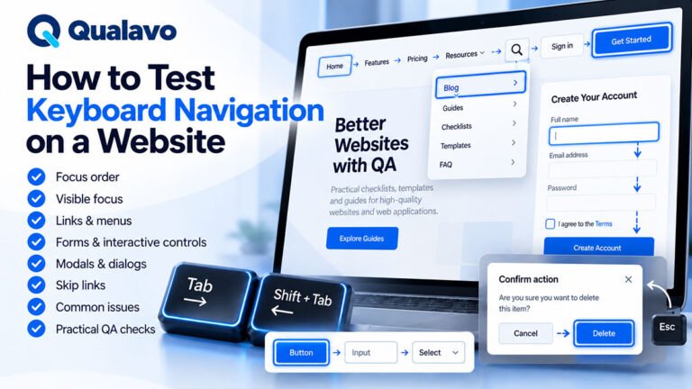
Try navigating the website using only the Tab and Shift + Tab keys.
At every step, ask:
Can I immediately tell which element currently has focus?
If not, the focus design needs review.
Dragging Movements
Some interfaces require users to drag items.
Examples include:
- sliders;
- sortable cards;
- drag-and-drop uploads;
- map controls;
- kanban boards.
Dragging can be difficult for users with limited motor control.
WCAG 2.2 requires appropriate alternatives in certain situations.
QA should check whether drag-only interactions also provide another practical way to complete the action.
For example:
- buttons;
- keyboard controls;
- click-based alternatives;
- text inputs.
The important question is:
Is dragging the only way to complete the task?
Target Size
Small interactive targets can be difficult to activate accurately.
This is particularly relevant on touch devices.
Examples include:
- tiny icon buttons;
- closely packed links;
- small close buttons;
- compact pagination controls;
- miniature checkboxes.
QA teams should inspect interactive elements for both size and spacing.
Do not test only whether a button works.
Test whether it can be activated reliably.
Consistent Help
If a website provides help mechanisms repeatedly across pages, users should be able to find them consistently.
Examples include:
- contact links;
- support chat;
- help buttons;
- FAQ links;
- customer service details.
QA should look for unnecessary changes in location or behavior across related pages.
Consistency reduces cognitive effort and makes support easier to locate.
Redundant Entry
Users should not be forced to enter the same information repeatedly within the same process when that information can reasonably be reused.
This is especially relevant in multi-step forms.
For example:
A user enters their name and address on step one.
Step three unnecessarily asks for the same information again.
QA should test long or multi-step workflows for duplicated data entry.
Possible exceptions exist where re-entry is necessary for security or to confirm important information.
Accessible Authentication
Authentication can create serious accessibility barriers.
Examples include requiring users to:
- solve cognitive puzzles;
- remember complex information;
- transcribe difficult codes;
- perform tasks that are inaccessible without an alternative.
WCAG 2.2 includes additional guidance around accessible authentication.
QA teams should test login and authentication flows carefully.
Check:
- login forms;
- password managers;
- copy/paste behavior;
- one-time codes;
- CAPTCHA;
- password reset;
- multi-factor authentication.
Authentication should remain secure without creating unnecessary accessibility barriers.
For broader authentication QA, see:
How to Test Login, Signup and Password Reset Flows
Keyboard Testing Should Be Part of Every QA Cycle
Keyboard testing is one of the easiest accessibility checks to add to a normal QA process.
Disconnect the mouse or simply avoid using it.
Use:
Tab
Shift + Tab
Enter
Space
Arrow keys
Escape
where appropriate.
Check:
- Can every important interactive element be reached?
- Is the focus order logical?
- Is focus always visible?
- Can menus be operated?
- Can modals be opened and closed?
- Can forms be completed?
- Can buttons be activated?
If an important workflow cannot be completed without a mouse, that should be treated as a serious accessibility problem.
Test Focus Order
The order of keyboard navigation should match the logical structure of the page.
For example:
Header → Navigation → Main content → Form → Footer
Watch for:
- focus jumping unexpectedly;
- hidden elements receiving focus;
- focus moving behind modals;
- elements being skipped;
- users becoming trapped.
A visible interface does not guarantee a logical keyboard sequence.
Check Form Labels
Forms are a common source of accessibility defects.
Each input should have an understandable label.
Placeholder text alone is usually not a good substitute for a persistent label.
Check:
- text inputs;
- dropdowns;
- radio buttons;
- checkboxes;
- date fields;
- file uploads.
The user should understand:
- what information is required;
- whether the field is required;
- what format is expected.
Test Form Errors
Error handling should work for more than visual users.
Avoid relying only on red borders.
A user should be able to determine:
- which field contains an error;
- what the error is;
- how to fix it.
Example:
Poor:
Invalid.
Better:
Enter a valid email address, for example name@example.com.
QA should test forms with intentionally invalid input rather than only successful submissions.
Check Color Contrast
Text and important interface elements should remain distinguishable from their backgrounds.
Common problem areas include:
- light gray body text;
- disabled-looking buttons that are actually active;
- text placed over images;
- placeholder text;
- subtle borders;
- focus indicators.
Use an appropriate contrast checking tool rather than relying only on visual judgement.
Also remember:
color should not be the only way information is communicated.
For example:
Green = passed
Red = failed
should ideally also include:
- labels;
- icons;
- text.
Review Alternative Text
Images can serve different purposes.
Some convey information.
Some are decorative.
Some function as links or buttons.
QA should check whether alternative text matches the purpose of the image.
Avoid automatically adding long alt text to every image.
Decorative images may not need meaningful alternative text.
Informative images should communicate the relevant information.
Test Zoom and Reflow
Users with low vision may significantly enlarge content.
A website should remain usable when text or pages are zoomed.
QA should look for:
- overlapping text;
- clipped content;
- horizontal scrolling;
- hidden buttons;
- unusable navigation;
- broken forms.
Do not assume responsive design automatically means accessible zoom behavior.
They overlap, but they are not identical.
Headings Matter for Accessibility
Heading structure helps users understand page hierarchy.
Screen reader users may navigate directly between headings.
A page should generally have a logical structure such as:
H1 — Page title
H2 — Main section
H3 — Subsection
Avoid selecting heading levels based only on font size.
For example:
Do not use an H4 because it visually looks right when the content is actually a top-level section.
Use CSS or block styling for appearance.
Use heading levels for structure.
Link Text Should Make Sense
Avoid vague links such as:
- Click here
- Read more
- More
- Learn
where the destination is not clear from context.
Prefer:
Read the website QA checklist
instead of:
Click here
Descriptive links help all users and make navigation easier for people using assistive technology.
Test Modals and Dialogs
Modals are frequent accessibility problem areas.
When a modal opens:
- focus should move appropriately;
- users should be able to navigate within it;
- keyboard focus should not disappear behind the modal;
- Escape should work where appropriate;
- focus should return logically after closing.
Also verify that the close button:
- can be reached;
- has an accessible name;
- is large enough to activate.
Test Responsive Accessibility
Accessibility testing should not happen only on desktop.
Mobile layouts can introduce new barriers.
Check:
- mobile navigation;
- touch targets;
- orientation;
- zoom;
- form controls;
- fixed UI;
- overlays;
- responsive tables.
A desktop page may pass many checks while its mobile version remains difficult to use.
Automation Helps, but It Is Not Enough
Automated accessibility tools can identify many useful problems.
Examples include:
- missing labels;
- certain contrast problems;
- invalid ARIA;
- structural issues.
They are valuable.
But they cannot reliably determine whether the entire user experience is accessible.
Automation may not tell you:
- whether focus order makes sense;
- whether alt text is useful;
- whether instructions are understandable;
- whether a workflow is practical with a keyboard;
- whether a modal behaves logically.
A strong accessibility QA process combines:
automated checks + manual testing + human judgment
and, for deeper assurance, testing with assistive technologies and real users.
WCAG Testing Is Not a Single Checkbox
Avoid treating accessibility as:
Accessibility tested: Yes
Accessibility has many dimensions.
A better QA record documents what was actually reviewed.
Example:
Accessibility coverage:
- keyboard navigation;
- focus visibility;
- heading structure;
- form labels;
- form errors;
- color contrast;
- image alt text;
- zoom/reflow;
- basic screen reader sanity checks.
This makes the scope transparent.
Build Accessibility Into the Test Plan
Accessibility should be planned before the final QA cycle.
Identify:
- the target WCAG version;
- target conformance level;
- pages in scope;
- supported environments;
- tools;
- manual checks;
- who owns accessibility defects.
For many projects, the target might be:
WCAG 2.2 Level AA
But the appropriate requirement depends on the project’s contractual, regulatory, organizational, and user needs.
Accessibility Defects Still Need Severity
Accessibility bugs should be triaged like other defects.
Severity should consider user impact.
For example:
High impact
- primary navigation inaccessible by keyboard;
- checkout cannot be completed without a mouse;
- login form controls lack usable labels.
Medium impact
- focus order is confusing on a secondary workflow;
- some important text has insufficient contrast.
Lower impact
- minor structural inconsistency that does not prevent task completion.
Avoid automatically treating every accessibility issue as low severity because the site appears visually correct.
A Practical WCAG 2.2 QA Checklist
For a basic accessibility QA pass, check:
- Main functionality can be used with a keyboard.
- Focus indicators are visible.
- Focus is not hidden behind fixed content.
- Focus order is logical.
- Forms have clear labels.
- Errors are understandable.
- Content does not rely only on color.
- Important text has sufficient contrast.
- Images have appropriate alt treatment.
- Heading structure is logical.
- Links have meaningful text.
- Interactive targets are usable.
- Drag interactions have suitable alternatives where required.
- Repeated data entry is avoided where appropriate.
- Authentication does not create unnecessary accessibility barriers.
- Content remains usable when zoomed.
- Mobile layouts remain accessible.
- Modals can be operated using the keyboard.
- Basic automated accessibility checks have been completed.
This is a practical QA baseline, not a complete WCAG conformance audit.
Accessibility QA vs a Formal Accessibility Audit
It is important to distinguish routine QA checks from a formal accessibility audit.
A standard website QA cycle may include:
- keyboard testing;
- contrast checks;
- labels;
- focus;
- basic automation;
- responsive accessibility.
A formal accessibility audit may involve:
- systematic WCAG success criterion evaluation;
- deeper assistive technology testing;
- screen reader coverage;
- documented evidence;
- specialist review;
- formal conformance reporting.
Do not claim that a website is fully WCAG compliant based only on a quick accessibility sanity check.
Be precise about what was tested.
Make Accessibility Testing Repeatable
Accessibility QA is more reliable when the same core checks are performed for every relevant release.
A repeatable process may include:
Plan → Automated Scan → Manual Checks → Report → Fix → Retest
Standardization helps teams avoid forgetting important checks and makes accessibility part of ordinary website quality rather than a separate last-minute activity.
Qualavo Professional includes a structured accessibility deep-dive as part of the more advanced website QA workflow.
Final Thoughts
WCAG 2.2 gives website QA teams a practical framework for understanding accessibility requirements.
You do not need to memorize every success criterion before adding accessibility to your QA process.
Start with the areas that frequently affect real users:
keyboard access, focus, forms, contrast, structure, zoom, mobile interaction, and accessible authentication.
Then build deeper coverage as the project requires.
Accessibility is not simply a compliance checkbox.
It is part of whether the website actually works for the people who need to use it.
Need a structured website QA process that includes deeper accessibility checks? Explore Qualavo Professional.